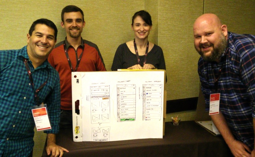
The following are my takeaways for the Neilsen Norman Group’s Usability Week session titled ‘Visual Design for Mobile & Tablet: Day 2’ (Austin, Texas) by Aurora Bedford:
“We want to communicate the information that something has changed with as little design and clutter as possible.” – Aurora Bedford
Performance is important in mobile/web application design, and there is both perceived and actual performance. In regards to processing and load time, it is important for the application to ‘feel’ fast rather than it actually being fast, and this can be done by planning a multi-step process for loading, serving adaptive images for specific devices, incorporating wait graphics (spinning or loading wheels), and all transitions and animations should be smooth.
https://twitter.com/tim_broadwater/status/596330828549857280
Something else that will help people not rage quit or have a halo effect without design overkill is providing the appropriate visual feedback on mobile devices. This feedback’s desired operation time is 0.1 second to 1 second, anything from 1 to 10 seconds is tolerable but cumbersome, and over 10 seconds makes the user feels out of control. Indeed, progressive loading is key, and pursuant to this is Luke W. shared on twitter a usability test for 25 minutes in length that shows how much time people actually spend ‘above the fold’.
There is no fold. [part 1] pic.twitter.com/OlcR1tWy7l
— Luke Wroblewski (@LukeW) December 8, 2014
Specific Assets on Mobile:
- Footers – Vertical bars between links don’t provide a lot of space; anchor links to footer can be very useful and avoid redundant navigation or excessive JavaScript.
- Forms – Reduce redundant elements and text to simply forms, group similar information, and align forms consistently with left labels/forms on larger screen, and labels and forms stacked on the left for mobile.
- Maps – Don’t place interactive maps near the fold or side on mobile, and always include the link to map for mobile users.
- Navigation – Use two elements at most, but no more: label, hamburger, carrot, plus sign.
- Search – If it can be sticky, make it so. Also, provide search options at the bottom of the page/in footer if page content is too long.
- Toggle Menus – contextual menus open as an accordion in page, and persistent menus should be tab-bars, sticky, or have overlay navigation/off-canvas buttons that are very obvious. Also, reduce to as little universal icons as possible.
Note to self – things to incorporate:
- Don’t ever use 404 errors or dead ends… instead show the search query and provide options.
- Condense center headers to one-block accordions.
- Facets and filters on mobile should not disappear/move, require instructions, or use icons only; they need to be apparent, and there need to be several indicators that ‘taps’ have been successful (color blocking works too).
- Use loading wheels for applications that require significant bandwidth.
- Explore and use hamburger-left, logo center, and search-right, navigation like http://www.apartments.com/.
- Experiment with remote un-moderated usability testing.
- Test character-limits on facets.

