The following are my takeaways for the Neilsen Norman Group’s Usability Week session titled ‘The Human Mind & Usability’ (Austin, Texas) by Aurora Bedford:
The core principles of this course are devoted to understanding Cognitive Psychology, Computer Science, and Human Factors concepts as they intersect in the field of Human Computer Interaction (HCI), and applying those concepts to design challenges. Users are very task focused on the web, so in regards to the addressed principles:
False consensus effect, or the tendency to overestimate how much other people share our own beliefs and behaviors.
Framing effect bias, users react differently to an option or idea based on the way it is presented.
Inattentional blindness, our minds filter competing signals or focus on specific details.
Lease effort, if there are several ways of achieving the same goal, people will choose the least demanding course of action.
Perception & Attention
User’s attention is very subjective and ultimately based on their current goals, the context of the situation, their prior experience, and their culture. Goals should be apparent and relevant mobile tasks should be prioritized. Website tasks should be familiar, practiced, become automatic, and then task resources are ‘freed up’. Over time users have developed ‘Banner Blindness’ so don’t make your website look like that. Furthermore, being conscious of the Gestalt principles of Proximity, Similarity, Closure, and Figure/Ground and using these principles successfully will help focus user attention and perception.
Memory & Knowledge
Mental models are representations of real, hypothetical, and imaginary systems based on predictions and outcomes from past experiences, culture, and context. There are both schema (descriptions of what) and scripts (overlapping associations) that developers can use to devise actions, criteria, and general functionality that people need/want; these become your primary tasks that need to be emphasized and prioritized, and it isn’t always about making something more efficient but more about matching expectations.
https://twitter.com/tim_broadwater/status/596723883736211456
In regards to how user memory work, sensory memory gives way to short-term memory, and through rehearsal of short-term memory, it becomes long-term memory. So, users take a ‘snapshot’ of stimuli and it moves to short-term memory if it is attended. Ergo, the following are highly suggested implementations for usability:
- No rotating banners/carousels – they erase iconic memory
- Show visited links – it allow users to remember what they clicked.
- Repeat search queries
- Avoid placing labels inside the form field
- Present all related information on the same screen
- Use tables for easy comparison versus just tabular data
- Use Relevant Icons
- Use typical images or graphics
- Navigation structure is based on relationship of concepts
Reading & Comprehension
For usability purposes, match icons and labels with the appropriate actions the user should execute. Also, content strategy is very important because 79% of users scan instead of read and jump from paragraph to paragraph, left to right, to skip over text that is less relevant; use context, because it helps to activate prior knowledge!
Problem Solving & Decision Making
When problem solving users employ heuristics, or ‘rules of thumb’, as mental shortcuts to simplify complexity and speed up processing. Likewise, the’re two types of decision making processes the the user employs in mobile website/application are maximizing (logical) and satisfying (emotional), and users are biased based on examples they have experienced.
Emotions & Design
- “Attractive things work better” – Don Norman
- We process things on three different levels: Reflective, Behavioral, Visceral
- People make decisions on first impressions
- Like a walk way made through the grass at a park, people will go where they want to go instead of taking the sidewalk.
Note to self – things to incorporate:
- More hover animations and transitions for desktop
- Create a pattern lab for and weigh using:
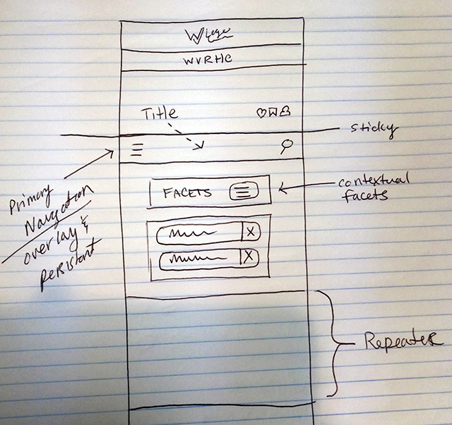
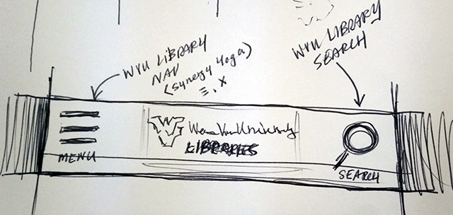
- Use a specific tab bar for mobile experiences (w/universal iconography)
- Use a top-sticky chrome for mobile (w/universal iconography)
- Develop branding and sub-branding guidelines for:
- Collections
- Libraries
- Digital Projects
- Web Applications
- Standardize, prototype, and usability test:
- Headers – collapsible higher ed. headers with carrots
- Navigation – collapsible with universal icons and hamburgers
- Search Box – streamline as a search box