

Considering that the width and height of each character in a type form are usually different across typefaces – even if they are rendered on the web as the same weight, style, and font size – I had to a while ago abandon the notion of using points and pixels in web design for EMs, or relative type since anyone’s screen resolution and font size can differ based on settings. So, the best example I have of type form alterations that would improve readability and legibility have to do with web design.
It has lieterally been years since I have used points, but I can tell you in case you didn’t know, that 1em, 14px, 10pt, and 100% all pretty much render the same for main text in website design. So, once you know that the default font size you want is lets sayis 16px, you can then use ems to allow your clients to resize the page easily but think in pixels for your font sizes:
- Headline 1 – 1.25em (16px x 1.25 = 20px)
- Headline 2 – 1.125em (16px × 1.125 = 18)
- Headline 3 – 1em (1em = 16px)
- Main text – 0.875em (16px x 0.875 = 14)
- Sub text – 0.75em (16px x 0.75 = 12)
- Footnotes – 0.625em (16px x 0.625 = 10)
However, you start to get into a lot of math and unnecessary computation, and since web design can be constructed in a web browser fast than in Photoshop, all you really need is wire framing to go by. What thing that I’ve have always found helpful is Google Fonts; and the fact that you can see how multiple type styling and weights can render for a specific font. It also uses the sentence “Grumpy wizards make toxic brew for the evil Queen and Jack,” as opposed to “The quick brown fox jumps over the lazy dog,” which lets you see every letter in the alphabet being used. An example of this can be seen for the very contemporary font family Ubuntu at https://www.google.com/fonts/specimen/Ubuntu, which is a set of matching new libre/open fonts in development during 2010-2011.
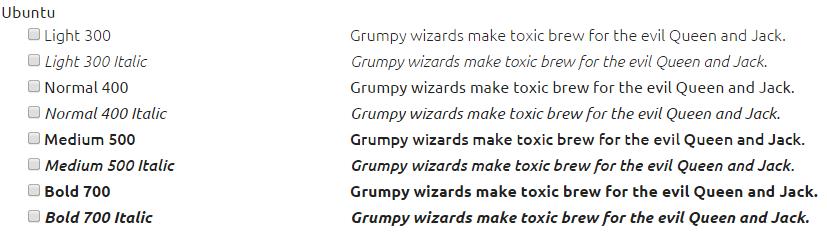
The new Ubuntu Font Family was started to enable the personality of Ubuntu – a Debian-based Linux operating system with Unity as its default desktop environment – to be seen and felt in every menu, button and dialog. The scope of the Ubuntu Font Family includes all the languages used by the various Ubuntu users around the world in tune with Ubuntu’s philosophy, which states that every user should be able to use their software in the language of their choice.
Indeed, the bread and butter of rendering type on the web is really in the font-size and font-weight CSS properties. Apart from choosing a font family, in website design you are not limited to how you can style a font through CSS versus as an image, and generally the serif (Times New Roman, Georgia), sans-serif (Arial, Veranda), and monospace (Courier New, Lucida Console) are fallbacks. Style-wise you are also limited to just normal, italic, and oblique and the text-transform CSS for uppercase, lowercase, and capitalization. A web designer can also use the CSS letter-spacing and and line-height attributes to function as leading and text-width.
And so, I generally use a 150% line-height CSS property on the web for main text to promote readability, but depending on the font a 125% line-height works well. Also, I generally try to stick to using modular scale with fonts which I didn’t do until I attended a presentation at Web Design Day in Pittsburgh, PA. Brian Warren gave a great presentation there on using modular typeface, and I would highly suggest that if you are interested in web design at all, to check out the presentations at http://webdesignday.com/.