
The Renaissance was a cultural movement that spanned the period roughly from the 14th to the 17th century and was characterized by an innovative growth of Latin and vernacular literatures, the political development of the conventions of diplomacy, and an artistic return to classicism through combining the imagery and mythos from Christianity, aspects of antiquity such as Greek mythology and manuscripts, and the reality of social criticism and satire through typographical elements.
A combination Christianity and mythology can be seen most successfully in the very popular and world known 1486 painting by Sandro Botticelli, The Birth of Venus (see fig. 1). Even though we don’t see typographical elements in this particular painting, Botticelli was commissioned to paint the The Birth of Venus by the Medici family of Florence. However, rather than a birth, what the viewer sees is a goddess landing on the shore. The theme – which can be traced back to Homer and to Ovid’s Metamophoses – is primarily mythological, but can also be viewed from a religious standpoint.
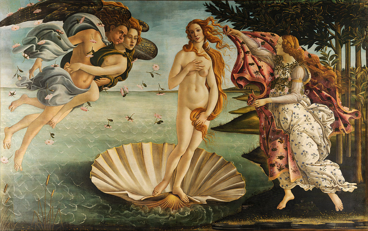
Figure 1. The Birth of Venus; Tempera on pane; Uffizi Gallery;1486, 2785 x 1725 mm.
For example, the nudity of Venus suggests that of Eve before ‘The Fall’ as well as the pure love of paradise. Once landed on the shore, the goddess of love will don the earthly garb of mortal sin, an act that will lead to the new Eve – the Madonna whose purity is represented by the nude Venus. Once draped in earthly garments she becomes a personification of the Christian Church which offers a spiritual transport back to the pure love of eternal salvation. The sea brings forth Venus just as the Virgin gives birth to the ultimate symbol of love, Christ. So, it was a common visual vernacular for mythology and religion to be given a social context in Renaissance painting, but what happens when typographical elements are added?
Similar to the themes of juxtaposition of Christianity and antiquity in The Birth of Venus painting, are the use of juxtaposition of concepts and social constructs through typography in Renaissance painting. The use of typographic elements in paintings from the 1500s to the 1700s can be characterized as providing societal insight into painterly figures, convening historical information about a painting subject within the confines of the painting, and capturing and representing the ideologies of a figure or painting’s subject matter.
In the 1532 oil on oak painting The Merchant Georg Gisze by Hans Holbein (see fig. 2), typographical elements were used in multiple places to identify the name of the Georg Gisze: on the note pinned to the wall, in the note in the figure’s hand, and even below the motto on the wall ‘no joy without sorrow’.
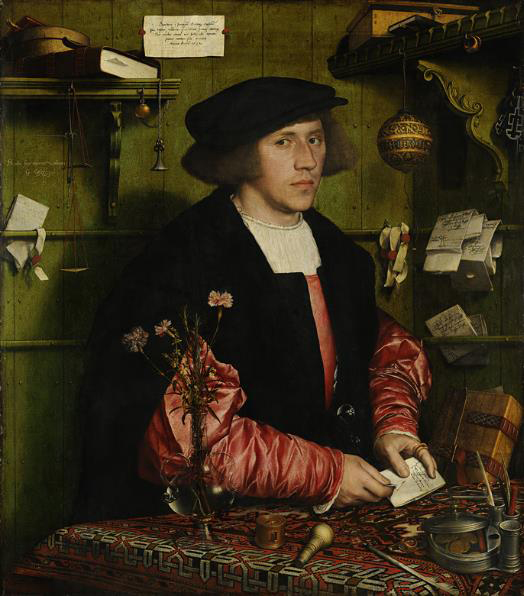

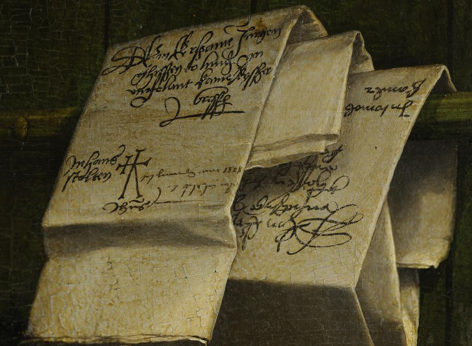
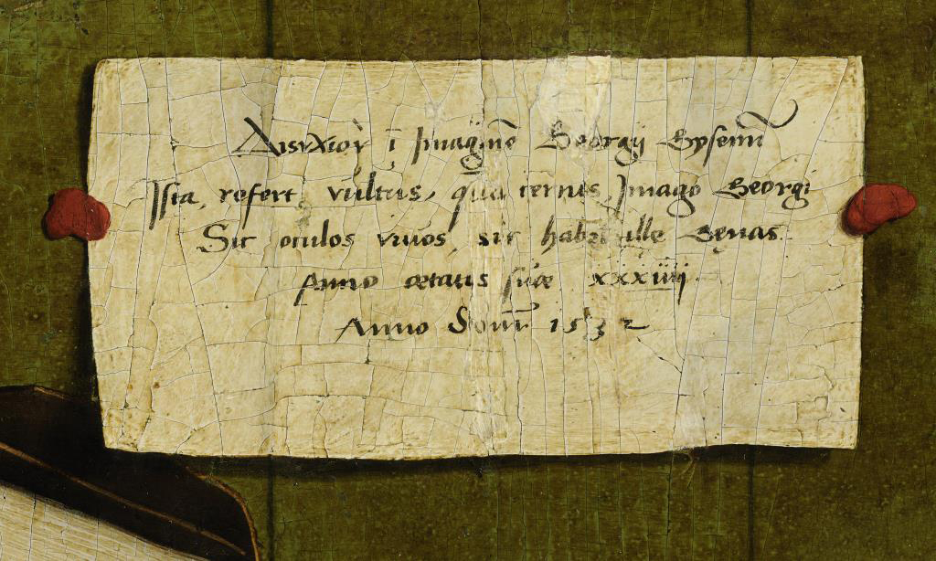

Figure 2. Der Kaufmann Georg Gisze (The Merchant Georg Gisze) by Hans Holbein; Oil on Oak Wood; Berlin State Museum; 1532, 86 x h97.5 cm.
Holbein distorts the composition to allow the viewer to see all of the pieces within the painting, which allows the viewer to read all of the typographical elements – notes, signs, mottos, etc. – within the painting. Moreover, all of the letters in the painting are perfectly legible and convey insight. The letters inform the viewer of the figure’s name (Georg Gisze), that Gisze was a London-based merchant, confirms that this was his appearance at the age of 34, that he was in constant touch with his family and other merchants in northern Europe, and that he had three different seals within the painting he has used to stamp the various letters with red and black ink. Indeed, one can see in the The Merchant Georg Gisze by Hans Holbein the role of typography in providing societal insight of the figure to the viewer, without which the viewer would have no idea of the figure’s occupation, family structure, and societal status.
Another use of typographical elements in Renaissance painting can be seen in the 1616 oil on canvas painting of Pocahontas by an unidentified artist, wherein the Indian princess who allegedly saved the life of English colonist John Smith, is seen surrounded by three different tiers of typographical elements (see fig. 3). All three tiers of the painting convey historical information about the painting’s subject, and ultimately convene a lot of history and information within the confines of the painting for the viewer.
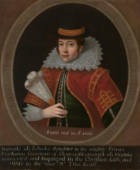
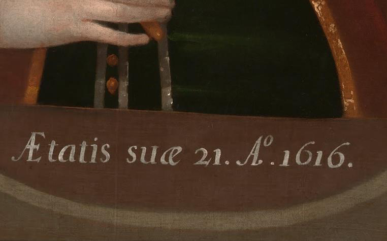
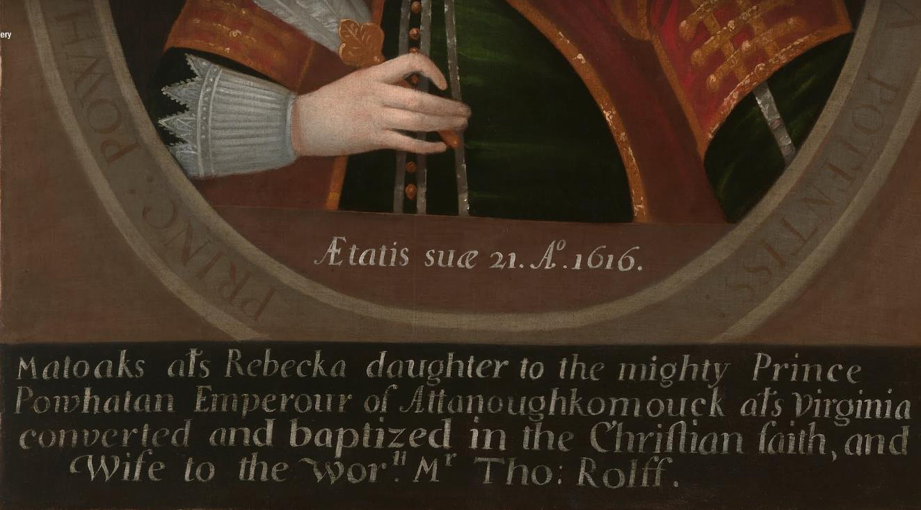
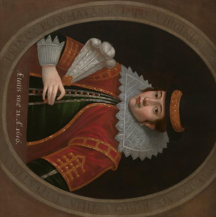
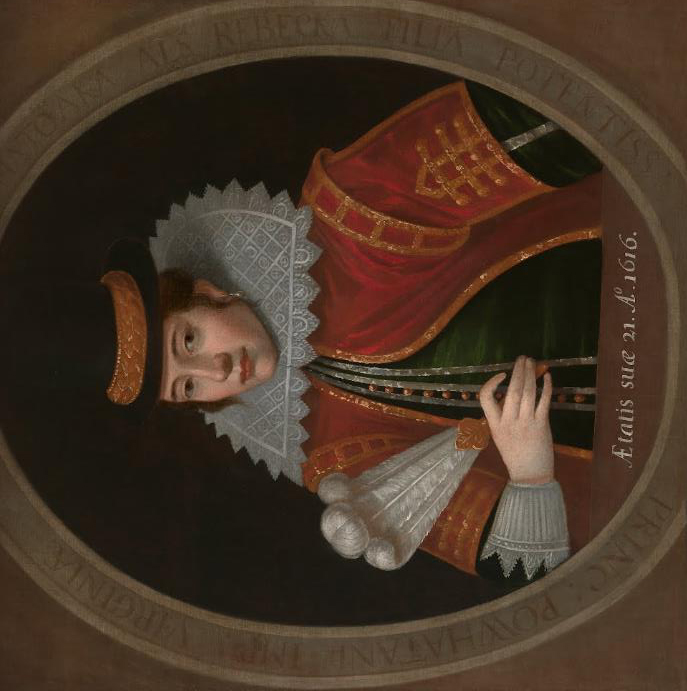
Figure 3. Pocahontas by an unidentified artist; Oil on Canvas; National Portrait Gallery, Smithsonian Institution; 1616, 648 x 775 x d25 cm (on stretcher).
The three tiers of information relay Pocahontas’ conversion to Christianity and marriage to Englishman John Rolfe, and dates the exact time period during which Pocahontas sat for her portrait engraving, on which the painting is based. Also noted with typographical elements is the importance of Pocahontas as a symbol of relations between colonists and Native Americans, and includes an inscription beneath, but through an error in transcription misidentifies her husband as Thomas (the name given to Pocahontas’ son). For certain, the Pocahontas oil on canvas painting is a perfect example of how historical information can be gathered into the confines of the painting, and relayed through typographical elements.
Furthermore, an example of typographical elements being used to capture and represent the ideologies of a figure of historical significance can be seen in the Death of Marat by Jacques-Louis David (see fig. 4). The Death of Marat is a 1793 painting of the murdered French revolutionary leader Jean-Paul Marat, and it is one of the most famous images of the French Revolution.
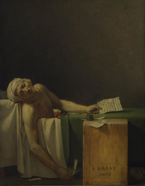
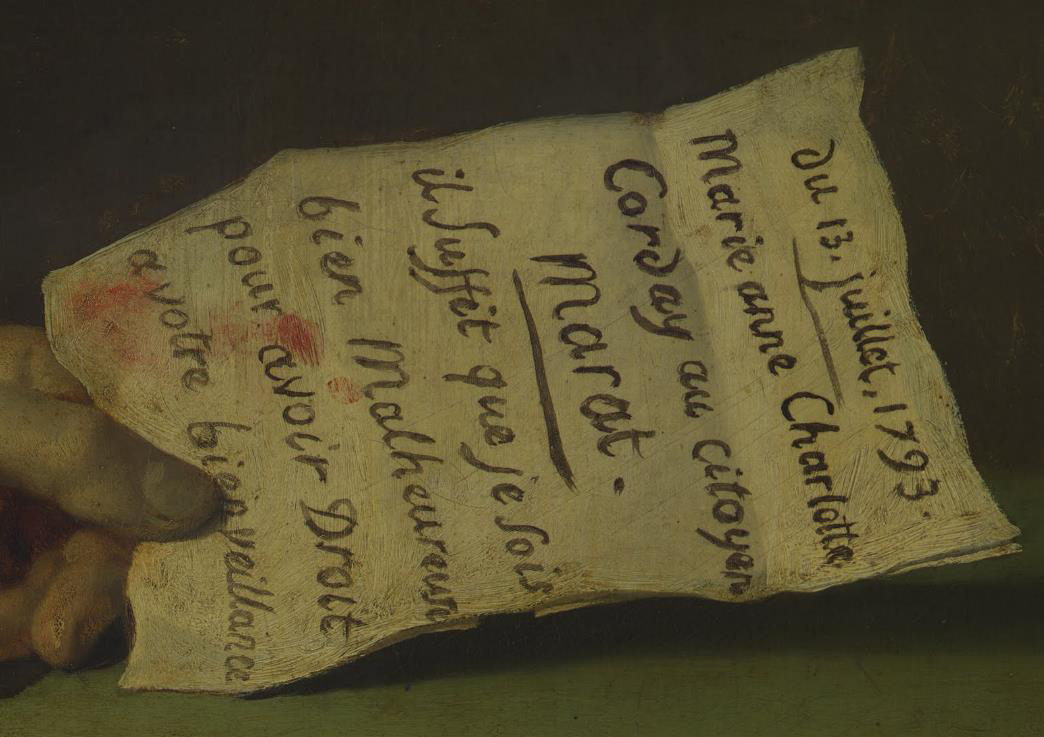
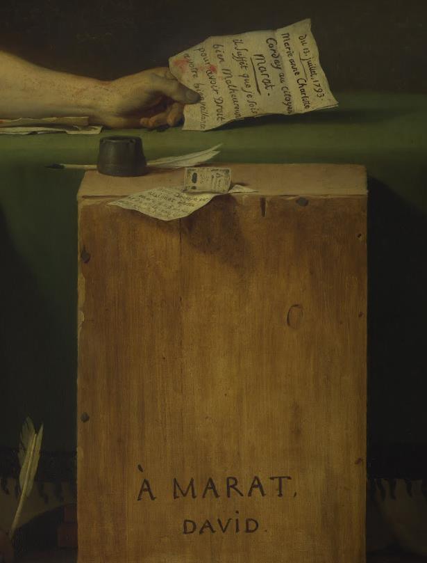
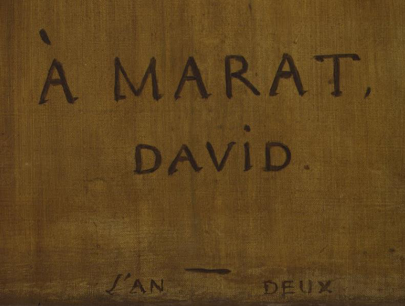
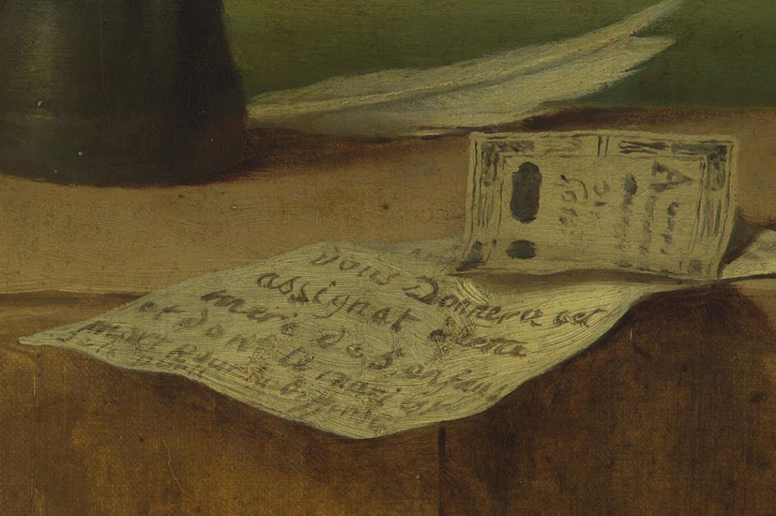
Figure 4. Death of Marat by Jacques-Louis David; Oil on canvas; Royal Museums of Fine Arts of Belgium; 1793, 1280 x 1650 mm (without frame).
What was significant about David’s painting is that he placed a contemporary subject in a contemporary setting. David thought that “it would be interesting to show him (Marat) as he found him, writing for the happiness and well-being of the people” (Frederik). Indeed the figure of Marat was humanized because there is no living room, assassin, or costume to date the scene, but rather just Marat naked in a bathtub.
Additionally, typographic elements parallel the powerful imagery in the painting by showing the elements of his revolutionary activity such as Marat’s writing utensils, but more importantly the altruism and public-spiritedness represented in the letter grasped by his dead hand. The letter’s textual content depicted Marat’s willingness to sacrifice his life to achieve his revolutionary ideals. Also, the name on the bathtub-side crate serves as a visual tombstone to Jean-Paul Marat, and is more visually striking than the bloody knife on the floor. And so, The Death of Marat by Jacques-Louis David is a fantastic example of how typographical elements in paintings during the Renaissance allowed the artist to capture and represent the ideologies of their subject matter.
In conclusion, the use of typographic elements in Renaissance paintings from the 1500s to the 1700s afforded the artist the ability to provide societal insight, gather and convey historical information, and capture and represent historic ideologies of their figurative subject matter.
Resources:
“Art Project.” Google. 22 Apr, 2014. Web. <https://www.google.com/culturalinstitute/project/art-project>
Canal Educatif à la Demande. “L’Art en Question 09.” YouTube. 1 Nov, 2012. Web. <https://www.youtube.com/watch?v=J0o3G1UovW0>
Leen, Frederik. “A Selection of Works.” Museum of Modern Art / Royal Museums of Fine Arts of Belgium, Brussels. 2001
“Online Etymology Dictionary: “Renaissance.” Etymonline.com. 31 Jun, 2009. Web. <http://www.etymonline.com/>